
A fascinating U.S. Immigration Interactive Map 1880-2000, is available online at The New York Times.

U.S. Immigration Interactive Map 1880-2000
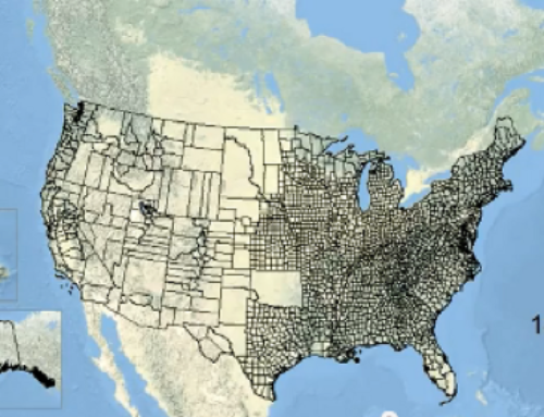
Both a research tool and a way to understand more about your immigrant ancestors, the map is highly customizable. As you can see in the image above, you can select from various countries to see how each settled across the United States each decade between 1880 and 2000. Data are available at the county and state levels for immigrants from these and other countries:
- All foreign-born
- Canada
- Czechoslovakia
- England
- France
- Germany
- Ireland
- Italy
- Japan
- Norway
- Poland
- Spain
- Sweden
- Russia
I love maps like these because I remain fascinated by my own immigrant ancestors, who left Norway, Sweden, Prussia, Austria, and Scotland, to come to Chicago during the Second Wave of U.S. Immigration. The push-pull factors for my ancestors migration were pretty evenly split between poverty and joining siblings who had already come to America. The U.S. Immigration Interactive Map 1880-2000 is a great tool for understanding how the United States was populated.

Leave a Reply